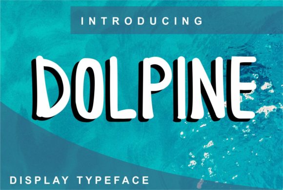
Dolpine: A Clean Display Font for Digital Branding
It started with a hero section—just me, a new coaching website mockup, and a blank headline space begging for personality. I’d been cycling through fonts that felt either too corporate or too whimsical, neither quite landing the warm-but-polished tone my client wanted. Then I dropped Dolpine into the H1 field, adjusted the tracking just slightly, and paused. The balance was immediate: modern without coldness, clean without sterility, distinctive without shouting. That’s when I knew this wasn’t just another display font—I’d found a digital collaborator.
What Dolpine Brings to the Screen
Dolpine is a premium display font built for impact—not decoration. Its letterforms are intentionally open, with generous counters and consistent stroke weight that hold up beautifully at larger sizes. There’s no forced quirkiness here: no exaggerated swashes, no unpredictable alternates, no dramatic contrast between thick and thin strokes. Instead, it offers quiet confidence—neat geometry softened by subtle organic rhythm. It reads as contemporary, approachable, and thoughtfully crafted. In web design terms, it’s a typeface that supports brand voice without competing with content.
How It Performs in Real Layouts
I tested Dolpine across multiple touchpoints: a boutique online store’s banner headline, a course sales page’s main CTA, a portfolio site’s project titles, and even a blog’s featured post header. On desktop, it shines at 48–72px—crisp, legible, and effortlessly balanced against imagery or solid backgrounds. On mobile? It scales cleanly down to 36px for hero text, maintaining clarity without tightening up or losing its airy structure. I paired it over a muted gradient background on a campaign landing page and was impressed by how well its even weight held contrast—even without heavy bolding, it anchored the layout without visual strain.
One subtle but important win: Dolpine renders consistently across Chrome, Safari, and Firefox, with no unexpected kerning shifts or glyph substitutions. No surprises in production—just predictable, professional behavior.
Where Dolpine Excels (and Where to Pause)
Dolpine is ideal for:
- Hero headlines and section titles — especially where you want warmth and clarity in equal measure
- Call-to-action buttons — its clean shape reads instantly, even at smaller sizes (20–24px)
- Logo text or wordmarks — works beautifully in SVG export for responsive logos
- Featured content cards — pairs naturally with image overlays and light text treatments
- Digital brand kits — feels intentional and cohesive alongside minimalist UI components
That said, Dolpine isn’t meant for body copy, navigation menus, form labels, or dense dashboard interfaces. Its design intent is display—not utility. For those roles, I always pair it with a highly legible sans serif like Inter, Poppins, or Manrope. This pairing creates strong visual hierarchy: Dolpine sets the tone; the supporting font carries the information. It’s a classic, effective contrast—distinct yet harmonious.
Practical Considerations for Web Use
Before dropping Dolpine into a live site, I checked three things: webfont availability, file formats, and licensing. The version I used included WOFF2 files (excellent for performance), CSS-friendly naming, and clear commercial licensing for client websites and SaaS dashboards. No hidden restrictions—just straightforward, ethical usage rights. I also verified multilingual support covered Latin-based languages (including accented characters common in European markets), which mattered for an international coaching brand.
For accessibility, I kept contrast ratios in mind—Dolpine’s medium weight meets WCAG AA standards against light and dark backgrounds when sized appropriately. And because it’s not overly condensed or stylized, screen readers interpret it reliably. No hidden traps, just thoughtful design.
Pairing Dolpine Thoughtfully
Font pairing isn’t about matching aesthetics—it’s about assigning roles. With Dolpine, I treat it as the “voice” of the brand: expressive, intentional, human. Then I choose a functional counterpart—the “ears” of the experience. My go-to is a neutral, highly readable sans serif for paragraphs, captions, and interface text. Occasionally, for editorial-style blogs or creative portfolios, I’ll swap in a gentle serif like Lora or Playfair Display—but only for headings one level below Dolpine, never for body. The goal is contrast with cohesion, not competition.
What surprised me most was how well Dolpine worked in animated contexts. I added a subtle fade-in + slight scale-up to a hero headline using CSS transitions—and the font’s clean lines made the motion feel smooth, not jittery. That’s a quiet testament to its structural integrity.
Final Notes for Digital Makers
If you’re building a brand presence online—whether it’s a solo creator’s portfolio, a small business storefront, or a course launch page—Dolpine delivers more than style. It delivers intentionality. It says, “I care about how this feels to use, not just how it looks.” It doesn’t demand attention; it earns it. And in a world of visual noise, that kind of quiet confidence is rare—and valuable.
Just remember: Dolpine is a display font, first and foremost. Let it lead, not linger. Use it where you want people to pause, connect, and remember—not where they need to scan, search, or act quickly. When placed with purpose, it doesn’t just sit on the page. It belongs there.